Designing Your Podcast Logo and Social Media Artwork: A DIY’ers Guide on Giving Your Show a Face
What did you do over the Labor Day weekend? The “last” weekend of summer? Did you manage to get out with friends or family for dinner? Maybe even enjoy a barbeque?
How about your business? Did you do any work on it? Just because it’s a holiday weekend doesn’t mean you can’t work on it! In fact, if you do, you’re just that much more committed to what you’re doing than those who took time off!
Personally, I worked a bit on Saturday and Sunday.
As I mentioned in the podcast from last week, Maria and I took pictures at the AMS MuncieMan Tri on Saturday. Always fun to get those posted and see all the reactions and comments come in afterwards. Personally I like this particular triathlon because it’s the MECTC championship race and has been for several years now. Always cool to see the different college uniforms of the athletes who showed up.
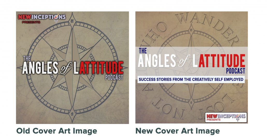
As for Sunday, I managed to do a little update on the podcast’s “general cover art” that’s seen in iTunes. You can see the difference below:
Why an Update?
Well, good question. I mean, I did have the same one on iTunes for over 100 episodes. Why change it? Well, a couple of reasons.
One, after 100 episodes, I have a much more focused picture on what the show is about. When I first started, I can’t say that was the case.
At the beginning, the idea was to have a few co-hosts on regularly to talk about being successful in life in general. What I realized, though, was that we were starting out WAY to broad. Soon after, however, I started using the format that we know today.
Secondly, I noticed that when viewed in iTunes, it didn’t necessarily jump out. So, sticking with the nautical theme, I opted to add a bit more liberty into it by giving it a bit more noticeable red, white, and blue. I mean, Angles of Lattitude does translate directly to Perspectives of Freedom after all!
Here’s a comparison of what I started with compared with the update:

Prepping for the Design Work
There are some things you’ll want to consider before starting on your design. Once you have the following ready to go, then you’re ready to start. That said, if you don’t want to do the work yourself, you might want to check out Fiverr, UpWork, or 99Designs.
Software
Personally, I use Photoshop for most of my work. (Currently running on CS5.) But there’s also free alternatives out there such as GIMP and Canva. If you don’t consider yourself artistic, Canva is a great option as it comes with layouts mostly designed for you. However, if you’re going for a certain theme, like I was, then you’ll probably want to use GIMP.
Image Specifications
When designing your podcast’s cover art, you’ll want to think about where you’re going to place it. For me, I currently have one image for the generic cover art, and then I have another format that I use for each individual episode. Last, but just as important, is a “social media” image that I make that has the same content as each individual, but laid out a little differently so that it fits within the post space in Facebook and Twitter a little easier.
Here are the specs for the canvases of those images:
Canvas Size:
Cover art: 1400×1400 to 3000×3000 pixels – Personally I use 1400×1400. Even with 4k becoming the standard more and more, I simply don’t see a need to make it much larger.
Also, make sure it looks good at a smaller size. Remember when folks are looking for your show, you’ll want it to pop out at them amongst all the others that are on that page.
Social Media: 1200×627 pixels – This is the canvas size for Facebook posts. Since Facebook no longer allows you to change this image manually, you’ll need to add it to the meta information you’re linking Facebook to. In WordPress, you can do this by changing the image used in Yoast SEO Premium. (This is a plugin that just about every WordPress user should have if they want to have good SEO.) If you don’t have this plugin, Facebook will more than likely use the Featured Image you have set for the post or page.
Pixels (Dots) Per Inch: 72 is the minimum. Personally, I use 300 dpi.
Colorspace: Use RGB (not CMYK)
Design
Ok, so you have everything ready to go and you’re looking at a blank canvas. Now is the time to ask yourself, what is this thing going to look like?
Crafting a design for the cover art is really no different than designing a logo. You see what you like out there, and then mimic it.
In this case, you can use the popular list on iTunes and see the covers of popular podcasts there.
Once you get there, you might notice that there’s a ton of shows that have the host on the front. If your brand is about you, or you’re tightly involved with the brand, you’ll probably want to put yourself on the cover.
If that’s not that big of a deal to you, then you can get a bit more creative and use more symbols in your artwork.
Since AoL is all about discovering other’s takes on personal freedom, I opted to stay with the original compass idea. However, I dressed it up a bit by surrounding that compass with the sentence “Not all who wander are lost”. This is one of the trending thoughts that i’ve learned through the first 100 sessions.
From there, I retouched the main title a bit and moved that up to the middle. I realized I had a ton of empty space in the last version and hopefully the title (now with a subtitle) will grab potential listeners’ attention a bit more!
Social Media Image Notes
If you’re wanting to change the social media image a bit per platform, there’s one thing I want to mention. Make sure that the theme stays the same from platform to platform. Use the same colors, same fonts, and just about anything else you can from one to the other. You want to make them look like they’re connected.
In the AoL Podcast social images, I even go as far as to use the same image of the guest of that session.
The only platform that I drift away from this approach is Instagram. From what I can tell, you get a bit more attention if your posts are visually engaging. So I try to change things around a bit and make the layout of the image reflect the long-form quote and the image that I have of the guest (which goes along with that quote).
Action Steps
So now that you’ve seen my new cover art, what do you think? Hopefully it inspires you to change your old one up a bit if it’s been awhile since you’ve modified it. I know several folks who make it a year to modify their artwork yearly.
If you have a show, I’d love to hear why you designed your cover the way you did.
Also, if you’re thinking about starting a show, you can check out my other podcast related posts here:


Leave a Reply
Want to join the discussion?Feel free to contribute!